Healthcare All About You! (HAAY!)
Healthcare design that feels supportive, not overwhelming.
ROLES
• UX/UI Design
• App Concept
• Graphic Design
OVERVIEW
A mobile app concept designed to help senior users manage physical and mental health through an accessible, guided interface. Created for client Hari Nair (Zuno Carbon CEO).
APPROACH
I designed a simplified interface with clear navigation, high-contrast visuals, and guided interactions. Color and hierarchy were used to communicate meaning and reduce cognitive load.
OUTCOME
The final concept demonstrates how accessible design can improve usability and confidence, providing a clear foundation for future development.


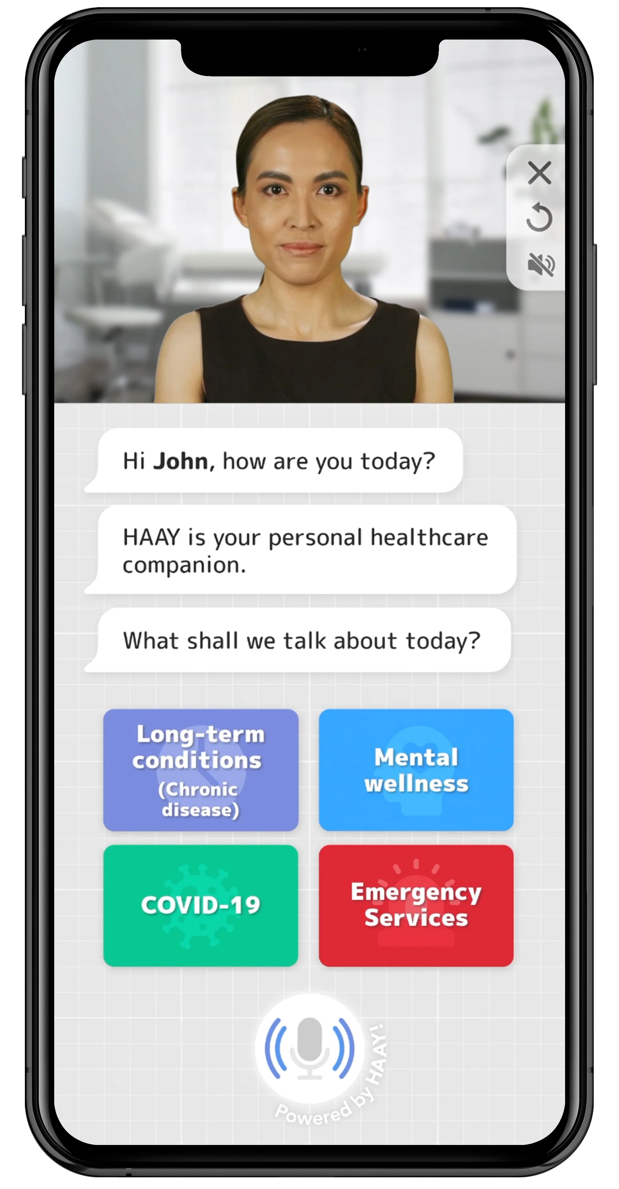
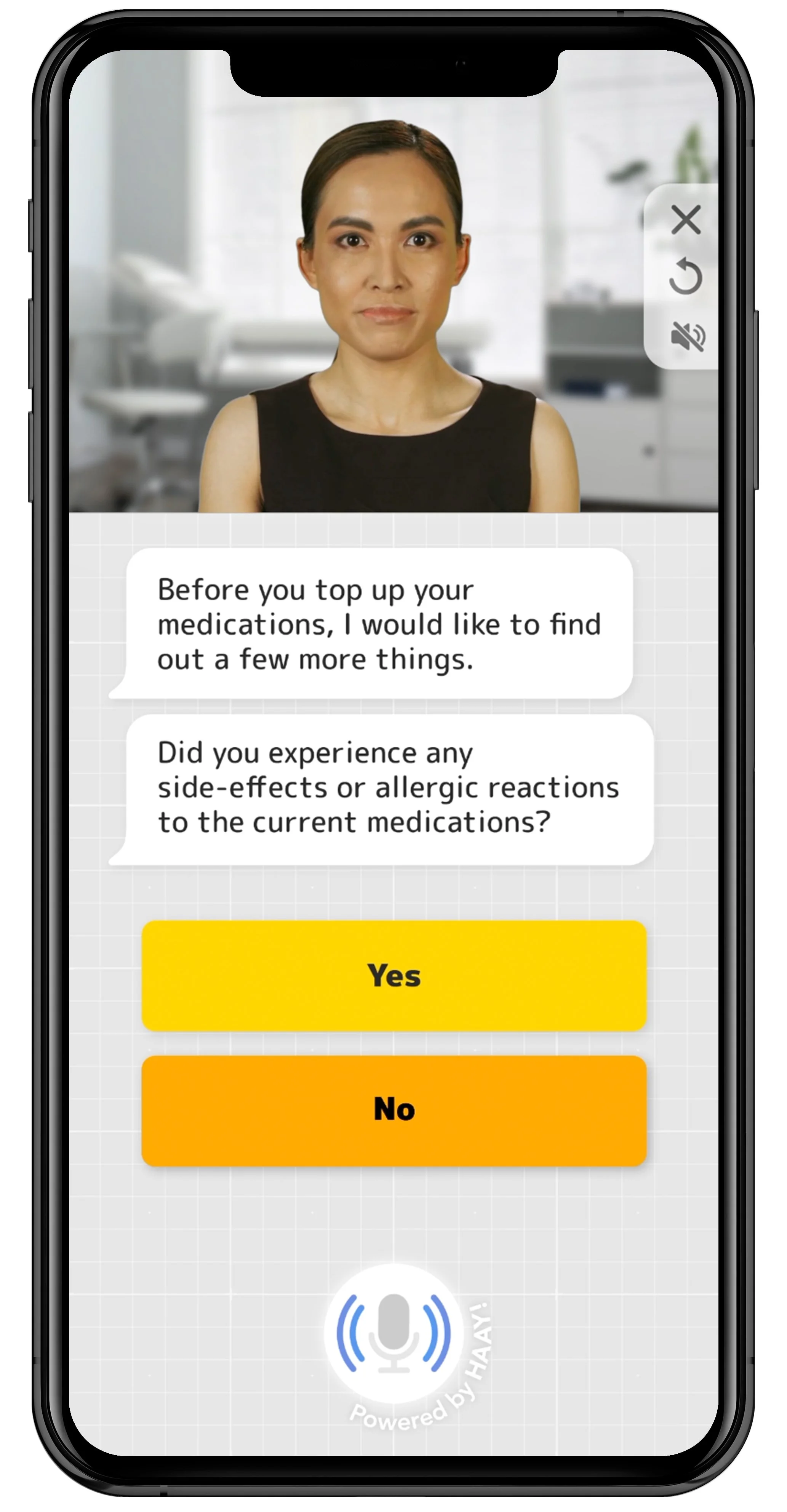
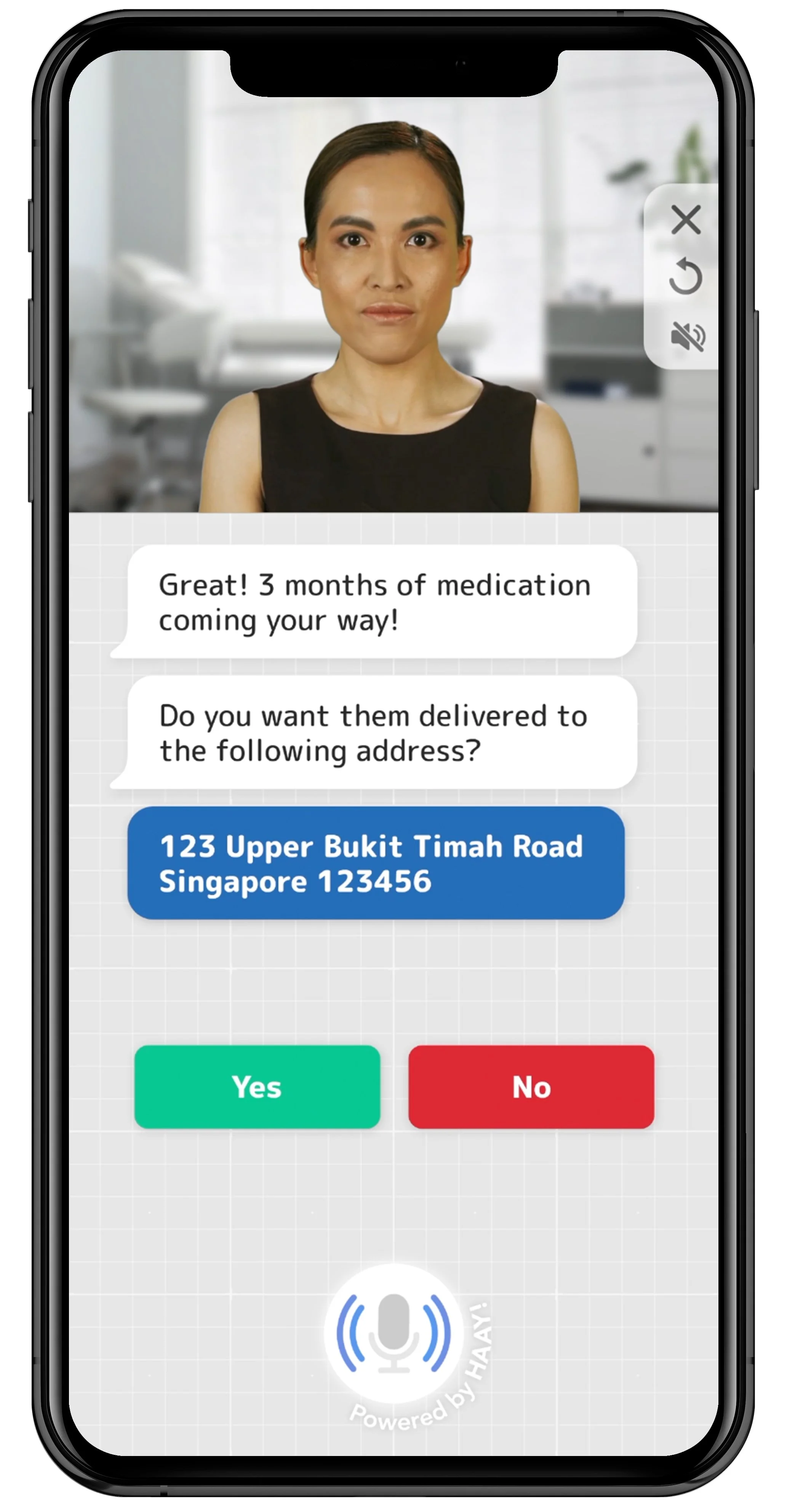


Red emphasizes urgency and decision, so I used it principally for Emergency buttons, “No” response, and medical warnings.


Green emphasized important confirmation buttons. Additionally, I used green for COVID-19 (as opposed to red) to reduce fear association for elderly population.


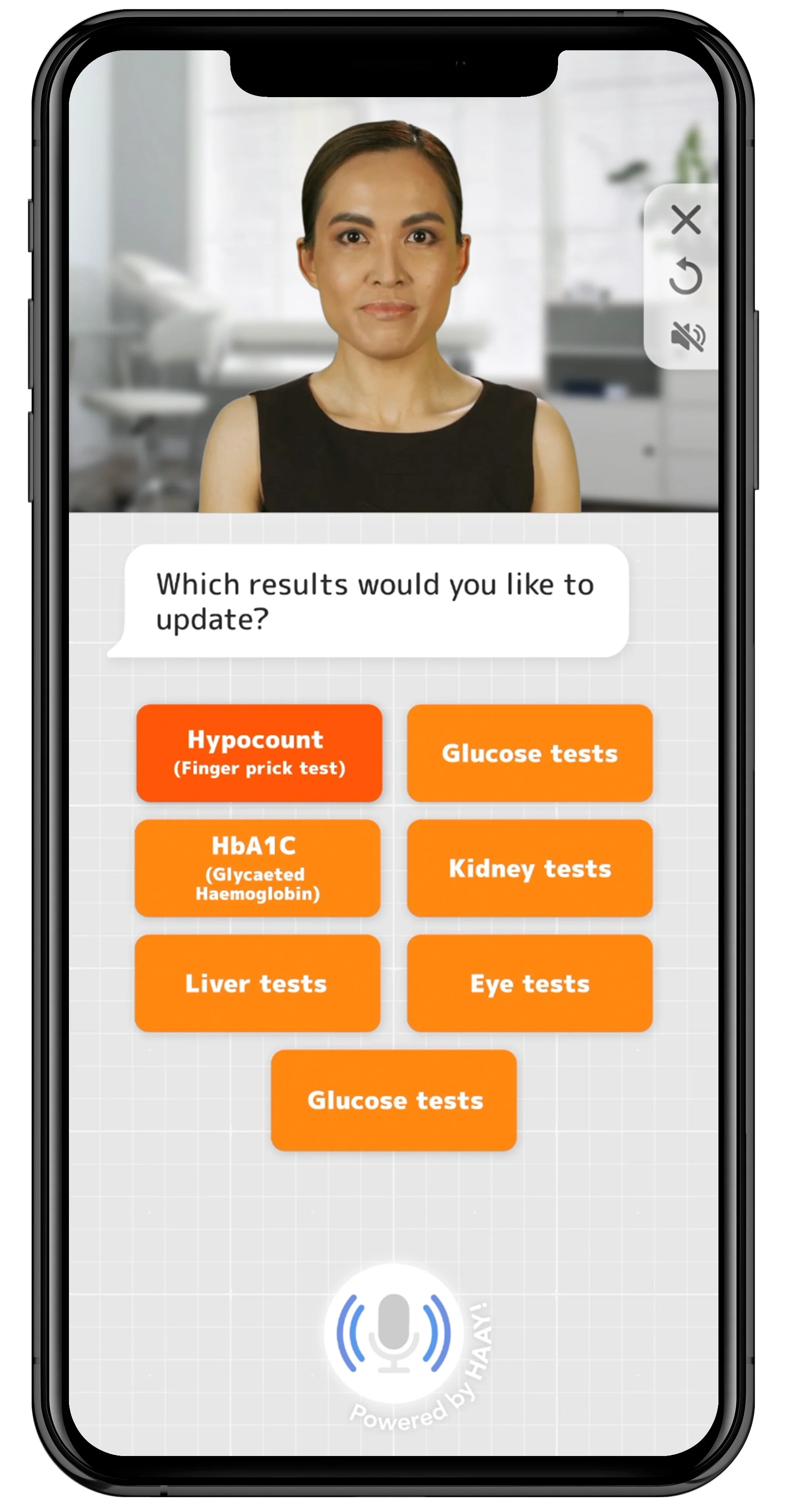
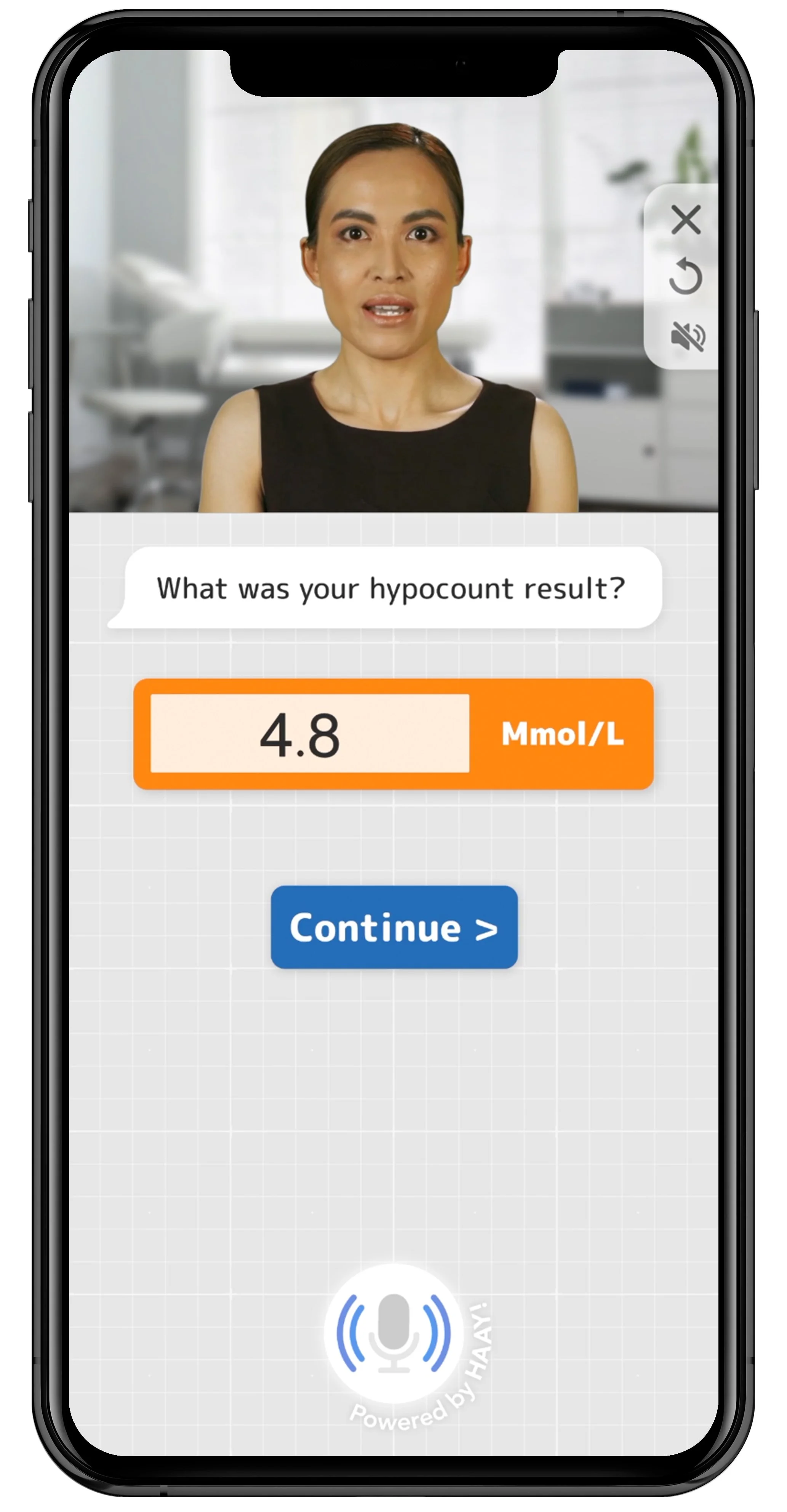
Orange gives priority as a brighter color but communicates less urgency than the color red, so I used this for Test Readings interface.


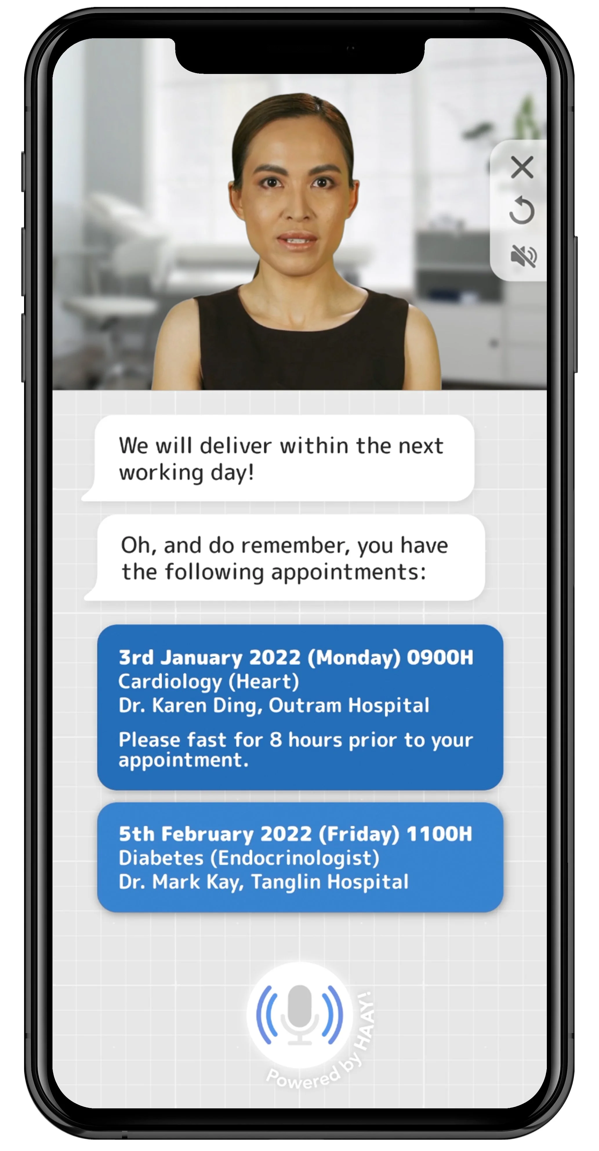
Blue was utilized for Mental Wellness buttons for a calming interface; I also used a hierarchy of blue shades to convey elements dependent on time/approval.

Gray in a lighter shade conveys professionalism without being overly clinical. The background color was a good medium between pure white (which may cause eye strain for seniors) and black, which could feel unapproachable.


Yellow is associated with energy, so I used it for the Medication subcategory to motivate users to check this feature regularly.


Purple was used for Long-term conditions/Chronic disease; I wanted cool-toned colors for all main menu items to prioritize red for strictly urgent items.
Mental wellness module script
Figma design file